Sunday, September 14, 2008
McCloud and Berger Discussion Questions
1. How effectively do you think McCloud crafts the comic-instruction in such a way that he -- pardon the pun -- illustrates the very points that he discusses, thus meta-commenting and reinforcing the lessons his character states? What particular lessons and images work well together? Which illustrations stuck out in your mind as aptly capturing a point? Why do did image, text, lesson work so well together in these particular examples? How, ultimately, does he reconcile LANGUAGE (of comics) and SOPHISTICATION?
2. You are designing your own comic. Where on the picture plane do you think your style would end up? What corner (beauty in nature, art or ideas) do you feel most drawn to, and how would your comic reflect that value?
Berger:
3. Berger argues that "Today we see the art of the past as nobody saw it before" (16). He then argues that "the camera -- and more particularly the movie camera -- demonstrated that there was no centre" (18). Finally, Berger decribes how this decentralization influenced art, but how can it help us understand sociocultural movements, biases, wars etc. that occurred before such decentralization? How hast it influenced globalization? How has it morphed how we share information (our blogs, facebook, youtube) and how does that change the way we see ourselves?
Saturday, September 13, 2008
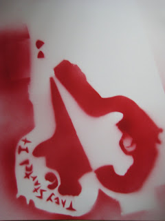
School Shooting Stencil


People remember where they were when JFK was assassinated. Or on 9/11. When the NIU shootings happened, I remember sitting alone in a big Illini Media newsroom overlooking
Nick sounded stunned, but alive. As I madly noted his words, my thoughts drifted back to the nights spent jamming in his aunt's basement. He used to beat the drums so hard that the skins warped. We played at grad parties, even recorded a lousy five-song album. But college was the end of the band. I went to
Then the shootings happened. Suddenly, breaking through the frozen cellular network to hear his voice was the most important thing in the world. But whether that was because I regretted two years of lax communication or because I needed his perspective for the story slotted for tomorrow's paper, I wasn't sure.
The next day, the aftermath, my story's headline read, "Connected." I had quoted Nick: "You go to college to be someone, then this happens."
Since, school shootings as a phenomenon of my lifetime have wedged themselves like a chink of ice in my heart, my mind, my subconsciousness. Thus the opposing revolvers morphed into question marks that form the shape of a heart. I could go on for paragraphs about what I see in it. But that would be antithetical to my intent. In addition to a heart, the interior forms a Rorschach inkblot pattern. I've read a lot about NIU and school shootings in general. I've written a lot about it. I've thought even more about it. I've interviewed police men, clinical psychologists, students, the associate chancellor, the student body president. And I've come to the following conclusions:
1. Police responded to the NIU tragedy with poise, intensity and calmness. They deserve our thanks.
2. We at the University of Illinois are as prepared as we can be, our police as sharp as humans in uniform can be.
3. No one really understands school shootings. And there is no emotional scale, metaphor or stencil to measure the suffering victims endure.
Thus, the design as a whole symbolizes, if anything, the disconnect between assumptions and reality; between safety and peril; between the signifier and the signified.
I did decide to spray-paint it on a Booze News article as a satirical stab at dark humor. For those infrequent readers, The Booze News glorifies the parties, sex, alcoholic excess. It is one of my guilty pleasures, partially because it is a symbol of our safety and luck. We can drink the night away, earn a story or two about being idiots because all our other more primal needs -- food, clothing, shelter, education, money, safety -- are satisfied. Or so we think.
Finally, the quote "They Started It" is from Jodi Picoult's novel Nineteen Minutes. It is what the shooter says is his excuse for shooting. The shooter is the magnet of constant bullying (hyperbolized a bit in novel form, I think) and so he eventually snaps in the form of a barrage of bullets directed at those who have made his life a living hell.
It's a reminder of the power of kindness we all posses and all use, I fear, too little. Who knows. A small smile, a handshake, positive reinforcement, a hug -- that's really all that matters. Our hearts can flutter to unimagined heights on the wings of love or be shattered in an act of sudden violence. And while some things spin on the whim of randomness, the destiny of our lives is contingent on the quantity of our love. Give a little, get a little. Ying and yang. Do you see why the stencil is balanced in opposing symmetry of red and white?
Tuesday, September 9, 2008
Response to Seth's Question
I don't think pathos is the main concern of formal and academic papers. A shame, sometimes, too, because we've all fallen asleep in a book and had the splotches from the page on our foreheads when we awoke. Could've used some more pathos to keep us awake.
But as the Wysocki's article states, the purpose of formal and academic papers is to allow for focus on the content -- what the text is saying rather than how it appears. I was intrigued by that philosophy book that did include variations of type, text and design in an academic publication. That had pathos for a scholarly purpose. But I think that variations in type and text are meant simply to designate key turning points in arguments or outlines (such as headers, footnotes, bold-faced key vocabulary words) rather than establish some pathos. So in conclusion: variations in text and appearance serve a coldly organizational purpose, not flamboyantly inject pathos. Why? Maybe they worry about a distortion of meaning, a distraction from the content? Or maybe they don't want to keep readers awake.
Sunday, September 7, 2008
Questions for Wysocki Article
2. Why do you think that italicizing a word gives it emphasis? Is it simply a learned association, or does the physical appearance of italicization actually generate emphasis? Why should or shouldn't you use italics in a thriller novel? Magazine? Newspaper? Term paper?
3. The article discusses lots of bells and whistles to signify meaning. Different colors, boldface, fonts, sizes, CAPITALIZATION, etc. Obviously the usage and purpose of these modifying agents is situational, but is there a certain standard or mantra that we could follow that maximizes informational transfer in speediest, most accurate, most efficient manner? If so, what standards can we employ? Is less sometimes more, or should we always use lots and lots of "bells and whistles" to aid the reader?

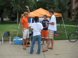
 Camp Out on the Quad is my fraternity's big fall philanthropy event for our national philanthropic organization: Push America. It works like this: We camp out on the quad 24/7 until we reach a benchmark funds goal. This year, that goal is $7,000. Last year we did $5,000. The Quad is prime territory as far as visual text goes, usually for advertising purposes. Walk around it once and you're almost guaranteed to find something chalked on the paths, benches or buildings. "Chalking the Quad" has become a slogan among RSOs looking to get the word out. Personally, I rarely work to decipher the scribbles of fading chalk.
So despite the heavy foot traffic and free audience, the Quad is not all milk and honey for advertising and text. For one, it's so saturated with text (chalk) that we're desensitized to ads. Plus, the Quad itself is so big that you need something big to match it. So we knew we had to go big or go home while designing this "Push America" poster. The goal is to make it big enough and lively enough so that people walking on the other side of the Quad can decipher it. Plus, the orange canopy and blue tent beg for attention. This year, we made Camp Out on the Quad shirts as well, although you don't see them in the picture because after a week of wearing the same rag, it don't smell too spunky.
But it's worked. We've drawn the attention of many students and even B. Joseph White, the president of the University. I won't tell you how much he donated, but we're still out there.
Tuesday, September 2, 2008
Response to Glenn's Question
Good question. I have a two-part answer.
One: The simple answer is yes, you can separate media styles at any fixed point of time. Magazines are different from newspapers are different from TV are different from advertising billboards on the interstate simply in the way that information is presented which, in turn, decides what kind of information the certain medium will present. Now, these different "styles" can indeed share similar pools of information. A magazine, website, newspaper and TV show can all advertise for Budweiser.
Two: Despite fairly clear distinctions among media styles, I do think, as the Bolter asserts, that media styles influence each other, or, as the question states, "lead to the other." A quick example: I know that the Chicago Tribune changed its layout to appear more like a webpage with the end of attracting a young hip crowd -- we Generation Y kids -- into its readership. This convergence of media styles is a good thing in that we get more consistency in the various forms of presenting, making it easier for us to digest information. It's exciting to say the least. As internet news threatens to put newspapers out of business, I can't help looking forward to the future and wondering: what is going to be even BETTER that will, years into the future, put internet medium out of business?
Monday, September 1, 2008
9/2 Discussion Questions
2. If media are striving to present us with immersive experiences that mimic realities we might not be able to otherwise obtain, what effects do these "simulated realities" have on our actual lives? Essentially: Why do we thirst for immediacy in our media, and what does this suspension of reality say about our own reality?
3. What's next? Is virtual reality with 100% immersion the last best phase of media? What does 100% immersion mean, and is it even achievable? If so, what purpose would we have for reality, and how would we know whether we are in reality or living a so-called computer program? Matrix references welcome.
